Professional Practice
why concept design? - Although this is more team work rather than authorial, this is a great way to involve yourself in bigger projects that might be able to drive good change.
why scribing/visualising? - visualising data from conferences/pitches and blocks of important text/research for the general public, people with language barriers, or learning difficulties could inform to highly improve their involvement and understading of social/environmental/political/economic etc issues. It could also encourage them to help in problem solving and providing suggestions for solutions to these issues, shrinking the distance between government and public (democracy). This brings hope in bringing people together again to tackle global problems that concerns all.
why reportage? - This similarly presents information in a socially engaging way. But there is a greater artist-subject connection, as (most of the time) the artist has to interview and deliberately spend a longer time with the interviewees than with a typical news reporter.
DRIVE?I've been devastated to see how far the modern west has fallen morally and intellectually, leading to needless conflict. I want people to have the freedom to think and question (they do but they don't notice), start acting, connect, problem solve, escaping the jail of consumer capitalism and the drug that is money. Thus, I to critically comment on issues and reframe problems so people could observe topics from different perspectives (something that people struggle with, proven by corrupt systems where the supporters of such political parties can't see the problems).
However, there is also hope in the public waking up to revolt and burst the festering governments in their countries/states. This is something that has recently worked in places like NewYork, Nepal, Hungary etc, and news about it has influenced other societies/communities to take action, making them rediscover a part of their group they have overlooked. Billionaire-lead capitalism teaches us to believe that individualistic lifestyles are ideal, when instead we should be supporting each other.
And so far, the best approach to working on this has always been to create work that attracts and engages the audience by sparking curiosity (even if they may not sympathise with it) which gets them to question and research down rabbit holes. Sometimes however, attracting audiences to interact with such themes can be difficult as usually theses issues are uncomfortable to face. Which is where allegorical communication, fantasy and beauty comes in (inspired by Misrach's quote on beauty in photography mentioned below).
Values
QUOTES THAT HELPED ME REFINE PATHWAY DECISIONS & FOR THINKING OF VALUES TO FOLLOW
"If you stop attacking the things you want to eliminate and instead strengthen the things which are incompatible with those things you want to eliminate, and are the kinds of things you want to see, then a great change is made" - Skinner
So I will challenge my frustration with overconsumption with underconsumption (see DIY handmade business cards) | tackle the loneliness epidemic by creating socially engaging work, encouraging conversation | play censorship's game of addressing truths glazed with allegories ( inspired by Bosch's surrealism, folklore and creative work under European communism).
"Beauty can be a very powerful conveyor of difficult ideas. Beauty is a delivery system: it engages people when they might otherwise look away"
- Misrach
Beauty and fanatsy are similar in aesthetic ways, they're great for communicating real world issues, and audiences tend to escape into them (ironically), away from harsh reality. Such media is The Lord of the Rings and The Hobbit (Tolkien), and anime like One Piece (Eichiiro Oda). Guards are lowered when consuming something pleasant, making it perfect to address ignored issues. And to solve the problem of assimilating real problems with fiction, I always plan to mention the actual issue at the end/scattered throughout.
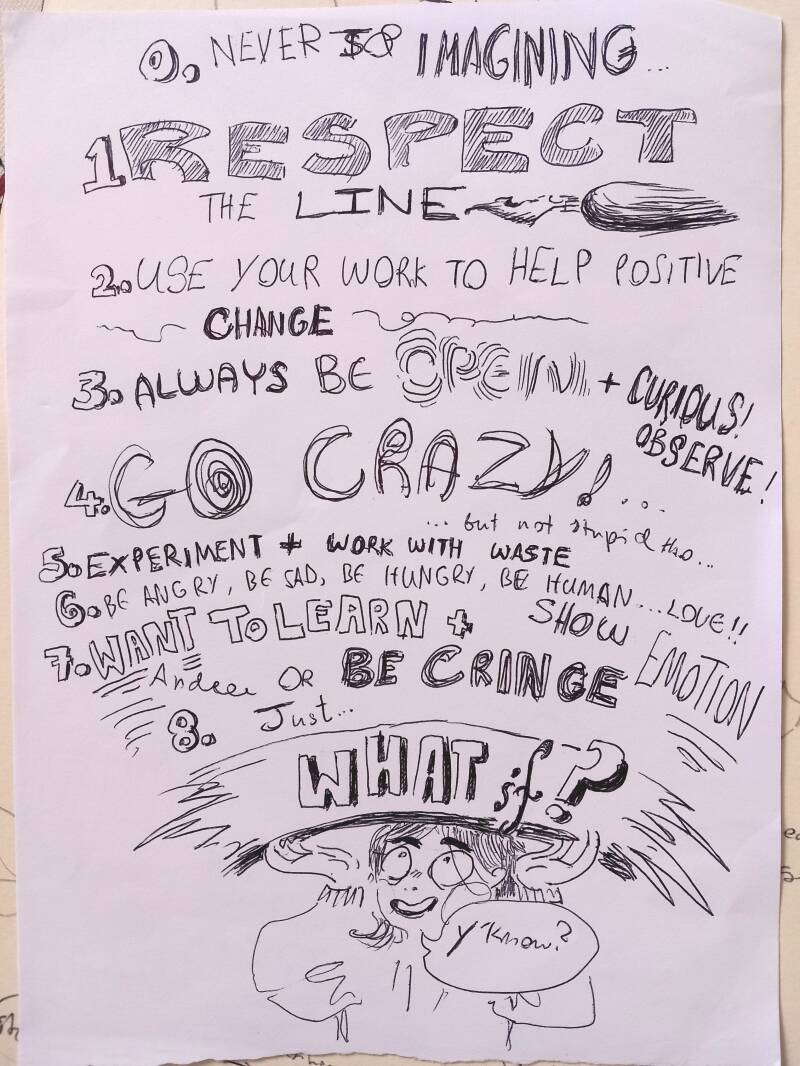
Manifesto
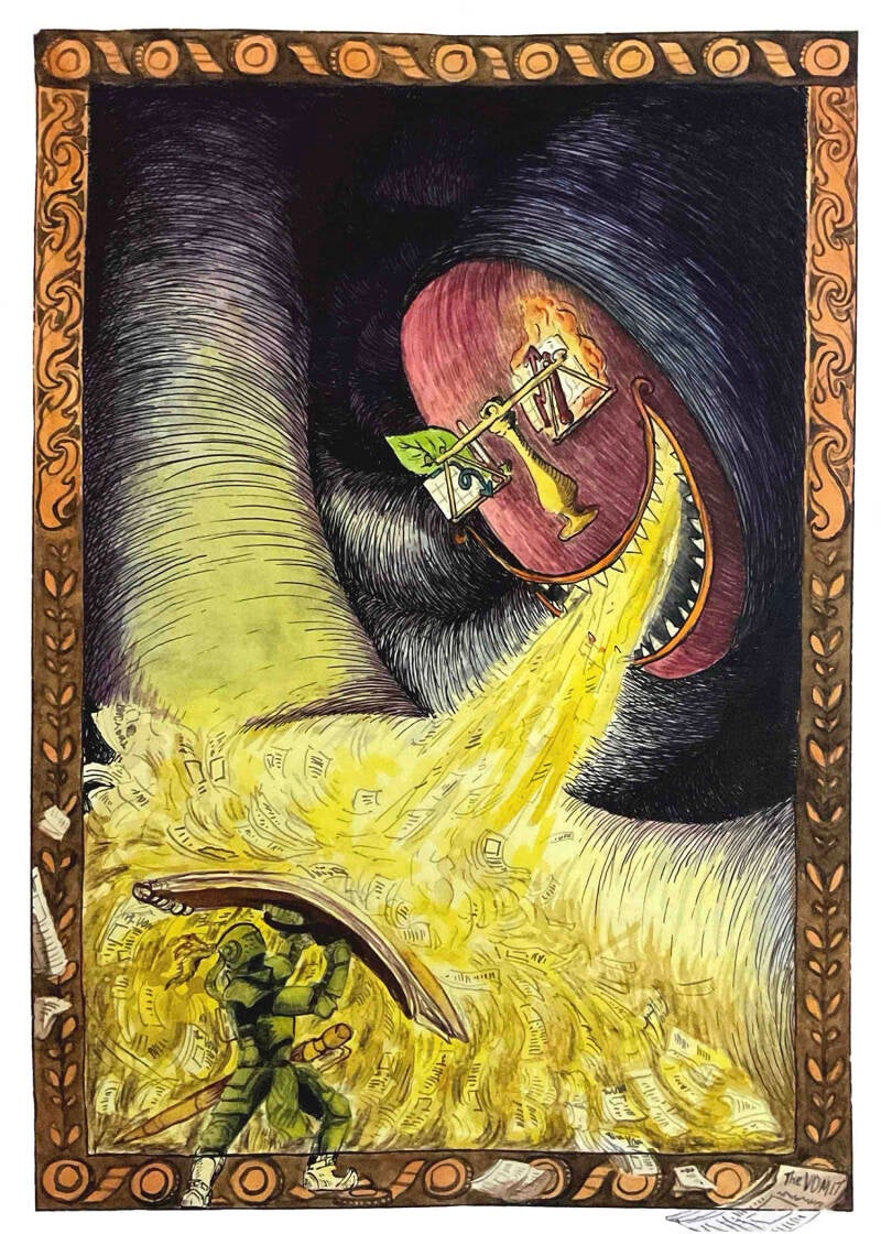
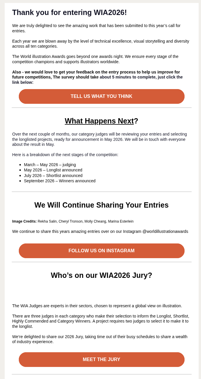
AOI WIA Submission
I submitted my editorial piece about how in media, fake news about the climate crisis drowns out truthful research. I do not have high expectations, as this visual language still needs refining and if I had more time, I would change many htings about this piece, but who knows what the judges will find pleasing this year?
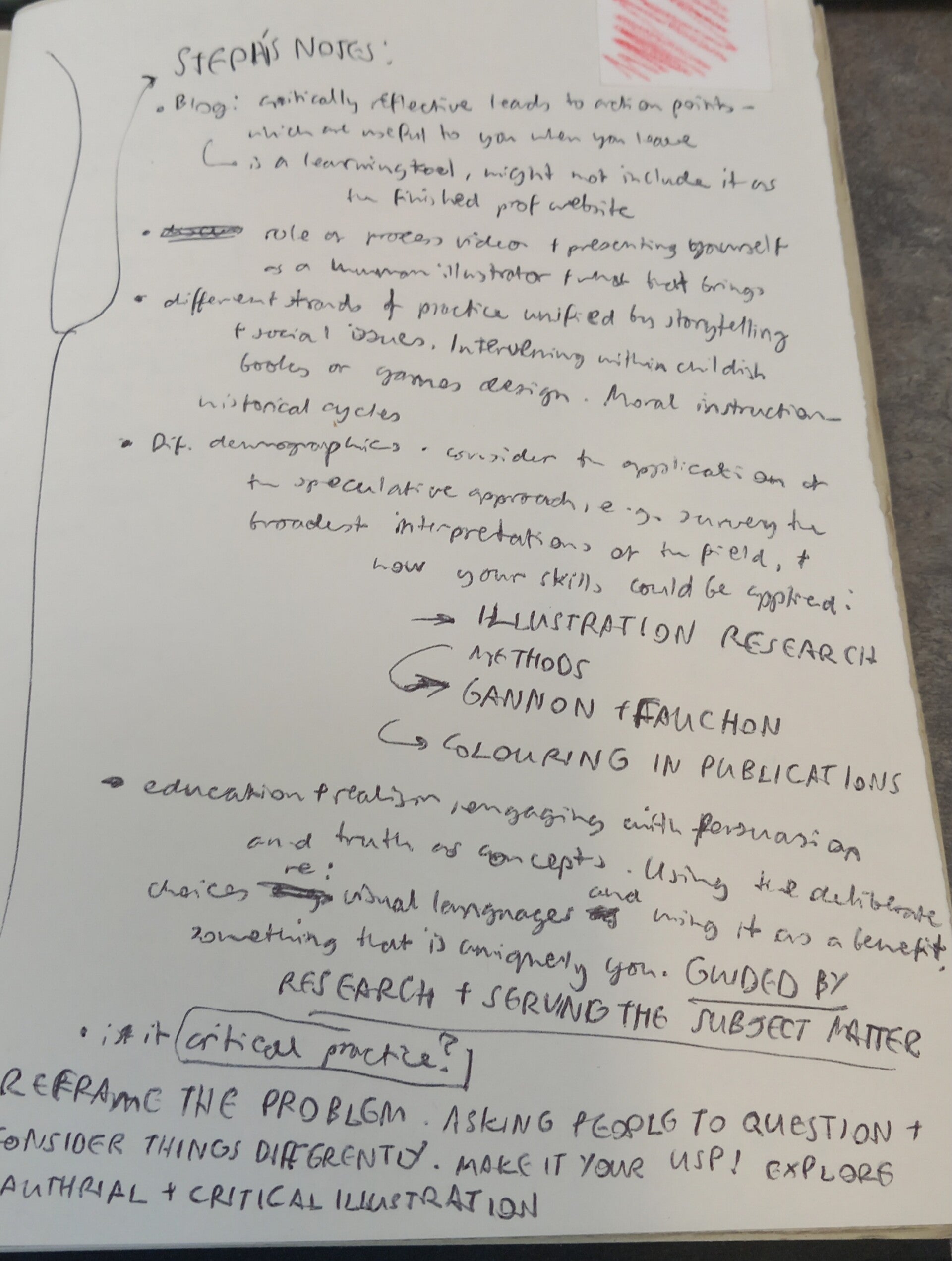
At the start of the module, I was worried about not being sure how to define my practice, and that it was a bad habit to work on different creative pathways with varying visual languages at the same time. It felt like I had to restart my creative life just to get noticed by directors. But these thoughts were before the first group tutorials, where I learnt that I could deliberately vary my visual language appropriately based on the contexts, and work on socially engaging and critically curious projects that reframe perspectives. This really lifted spirits about continuing my illustration career, and I also noticed that clients/collaborators found it convenient that I could drastically vary my work - which I have also found to be an awesome experience.
However, I noticed that this is more of a niche, research-based branch of illustration, so my learning process will likely go off the map, onto different maps, and finding information between the lines that represent areas of creative practice.
And the following information was a great start to this:
Alternate branches of Illustration by Stephanie Black
https://www.colouring-in.com/
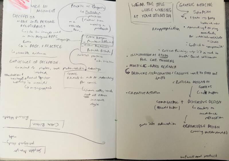
Catrin Morgan, Ester McManus, John Miers, Mitch Miller
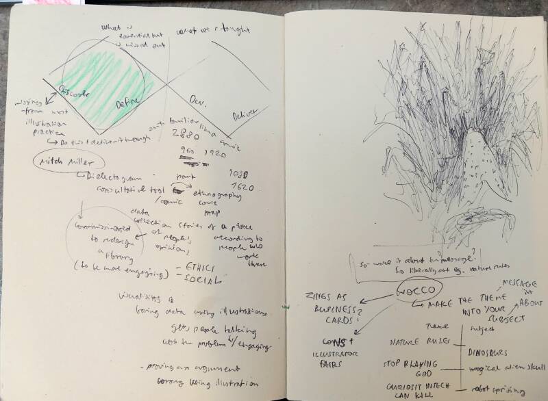
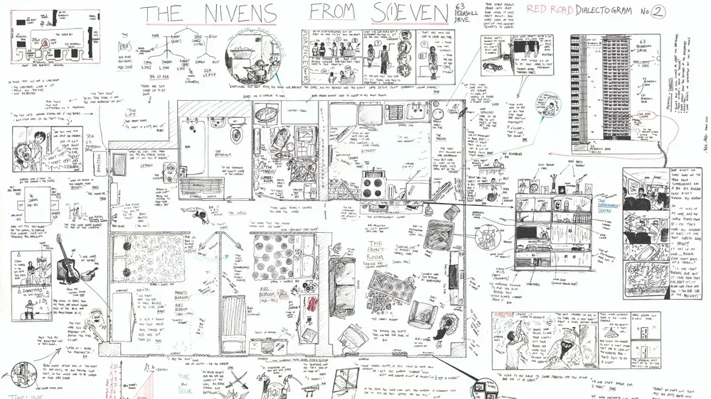
Mitch Miller's dialectograms are something that I have been trying to name, and struggling to express for a long time, until I found his work! This is because these visual guides are not exactly scribings, diagrams, inforgraphics, reportage or sequential narratives, but... 'dialectograms'. And desipte being his own invention, he managed to use it to redesign public spaces like libraries and create social maps that unite communities to reflect on visualisations of their areas (like markets, dwellings etc). (a similar artist could perhaps be Chris Ware?).
Personally, these dialectograms are fulfilling to study, as the extent of information forces the viewer to slow down and carefully read all the little notes and learn about systems of living. It's almost like if a text-heavy research thesis would be translated into one big information map (unlike scribing where ideas are visually noted mostly like sequential narrative). I think work like this makes it far easier to process information, and also caters to a much wider audience due to the visual readability of the drawings.
Mural Workshop With Dave Bain
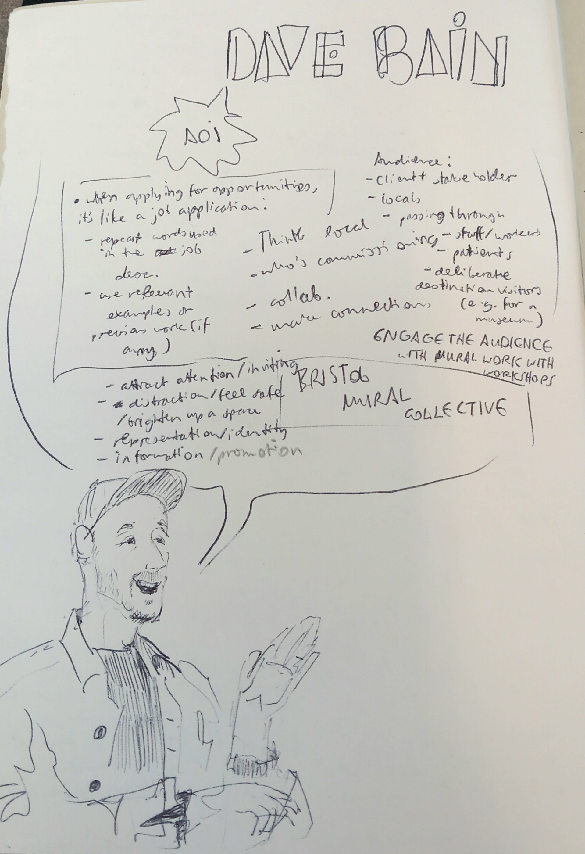
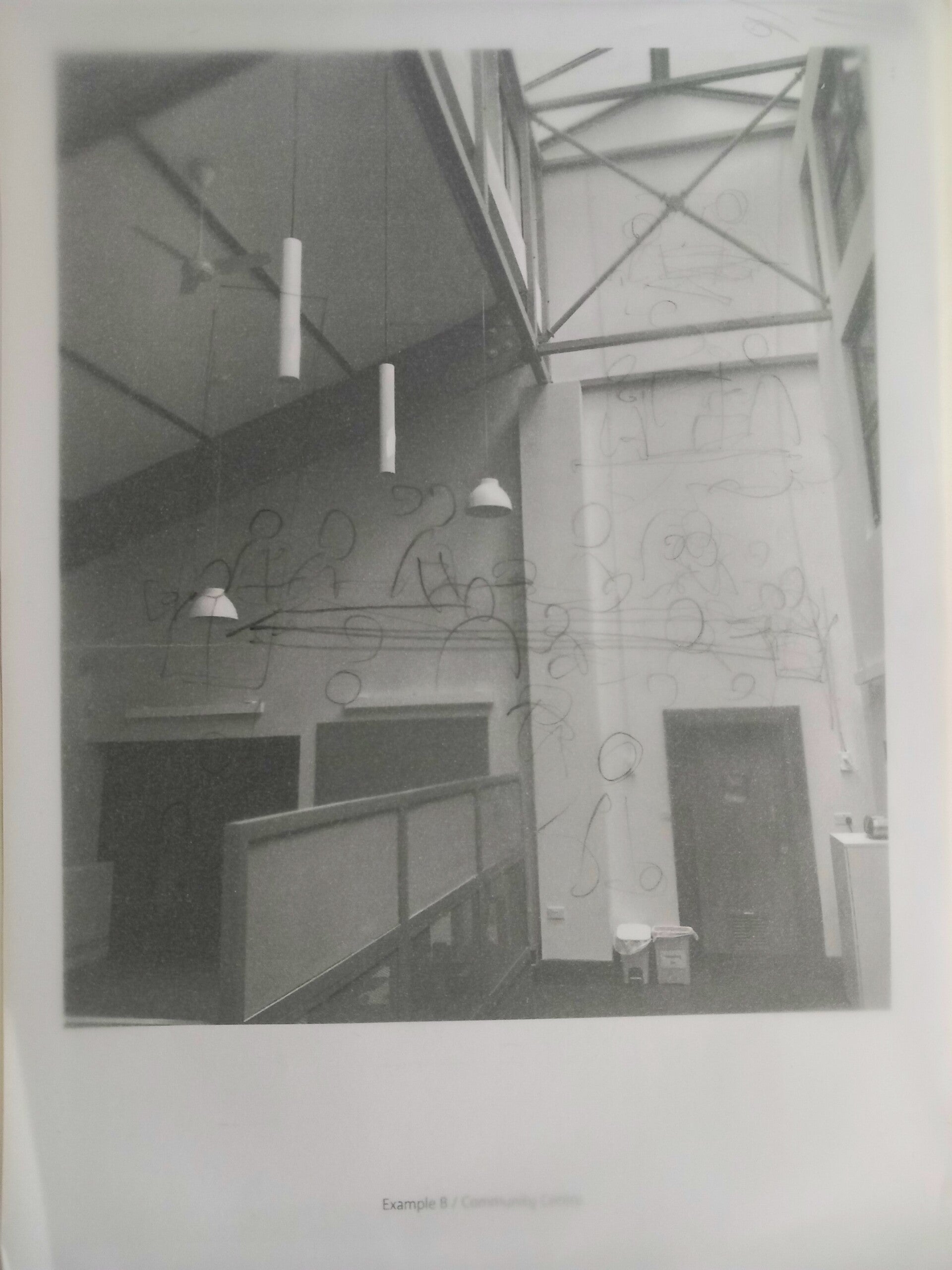
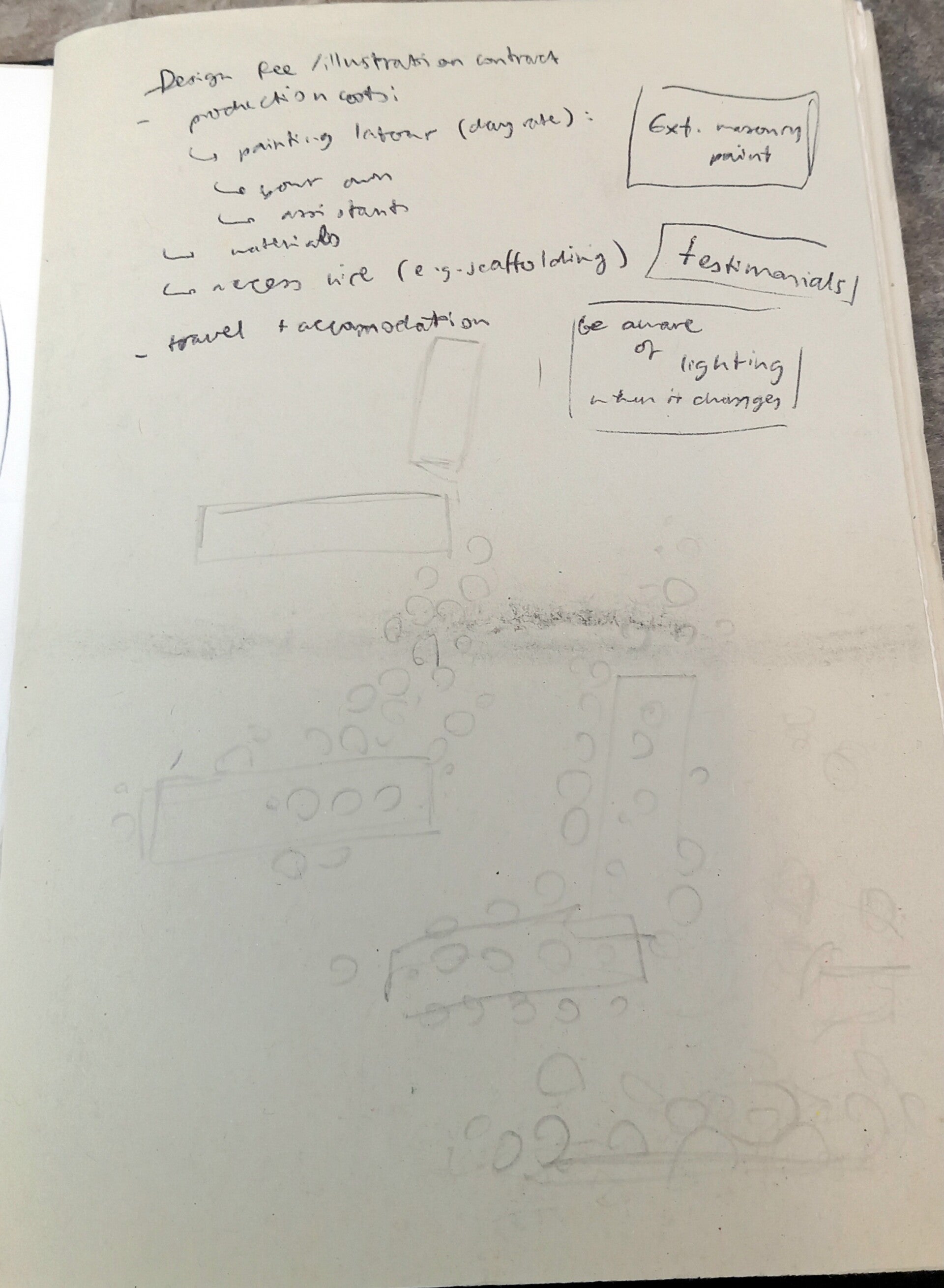
This was a great chance to learn from an artist with a bigger focus on murals than most, as I have recently realised just how in demand, beneficial, fun and satisfying mural work is (when I made my first mural in 2024). I was familiar with this hurdle, but it was still a great activity to understand how to overcome composition challenges when designing murals and working to a brief. The money side of a mural commission and covering time managementn, health and safety, and costs of paint/cherry pickers/scaffolding were new however. This will definitely be useful in the future, as I would love to continue working in large scale, and maybe even help in community projects like Pollinator Pathways.
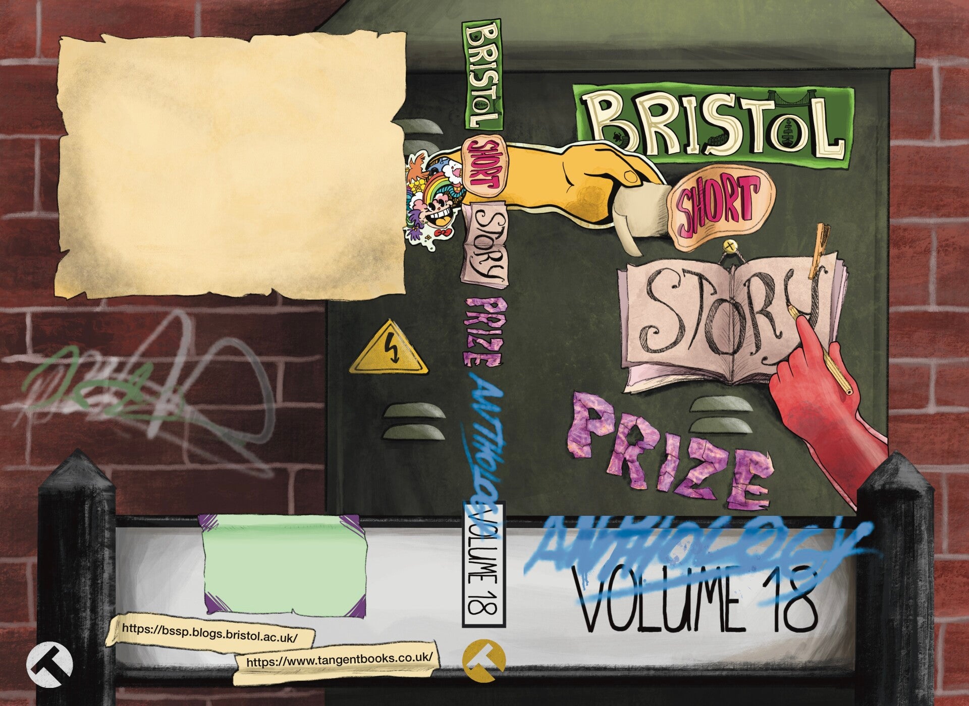
BSSP Anthology Volum 18 Submission (very late hand-in)
Inspirarion for this book cover design were Bristol's graffiti and storytelling in public spaces like small side alley that leads to the centrespace galleries. But for that, I think I should've added more graffiti.
Fundraising
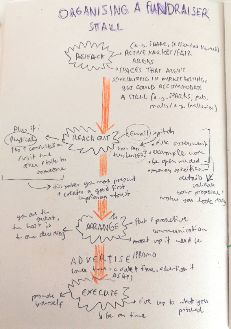

Me and multiple people (around 13) in our class were already going to fairs and markets to draw on demand/on request, and were very successful. But they were rare, inconsistent occurances and this can be a very hectic process if done alone. So I decided to create a fundraisng group where we draw on demand at a separate stall at regular intervals either on campus or at external events. Usually, 2-5 people would be working at the stall, a simple working process: interested customers come up to our table, and request an illustration from an artist they choose based on art style preference, they then pay £4-5 mininum and they are notified that the drawing will be done in average 15-20 minutes. We can draw they anything from portraits to animals with reference provided if needed, but no 18+ or offensive requests!
---!We named this stall idea as 'The Drawing Booth'!---

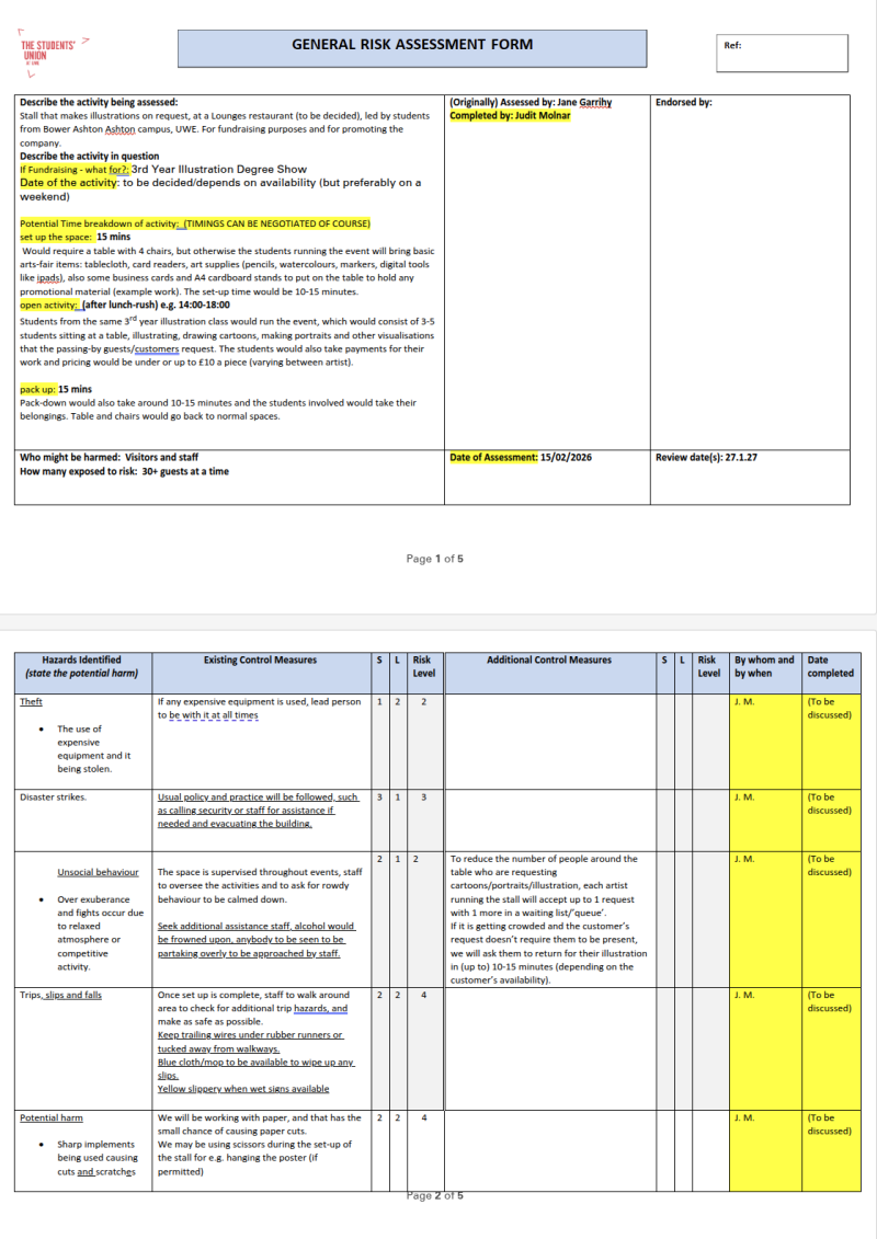
I was in charge of the cooridating and 'paperwork' side (including pitching this idea to external spaces and making risk assessment forms like above), so I arranged multiple days with Jane Garrihy (at InfoPoint) to run this stall at Bower Ashton's canteen. This turned out to become very popular between the students and staff members, so the group wondered if we could take this outside of campus. So let the arranging and email writing commence!
External Application Email Structure
For pitching this idea to external spaces (public spaces, bar/pubs/events like SPARKS, Water Shed, Strange Brew, Lounge etc) that could host programms. It honestly felt very entrepreneurial, but it was worth it.
I am an illustration student in my third year at Bower Ashton, UWE (University of the West of England), and I am writing to ask if there is the possibility of your cafe/shop/site accepting the on- site hosting of a highly engaging fundraising stall. Here, me and 3-4 students artists from our class would raise funds for our end of year degree show, drawing/sketching/painting anything that passing-by customers ask for (that is nothing offensive or 18+, as our terms mention in the attached risk assessment form request for art that may be offensive, may portray violence or contain explicit 18+ content will be immediately rejected, and the artist can choose to refuse any further requests from the customer). This can be fan art of analogue and digital media, their own original characters, portraits and much more (creatures/scenes/character etc). As one of the students, I am writing to you because we believe that you and your company would be perfectly aligned with our class’s values of the importance of community and with effective promotion, we might potentially be able to increase your site’s footfall.
I have attached an accepted risk assessment form, a concept sketch of the stall for better visualisation, and some example work that me and the students on this fundraiser can make.
We perfectly understand if there is a fee
Thank you very much for reading, I appreciate your time, and let me know what you think of this idea. I hope to hear from you soon.
Kind regards,
Judit Molnar
Illustration Student
UWE
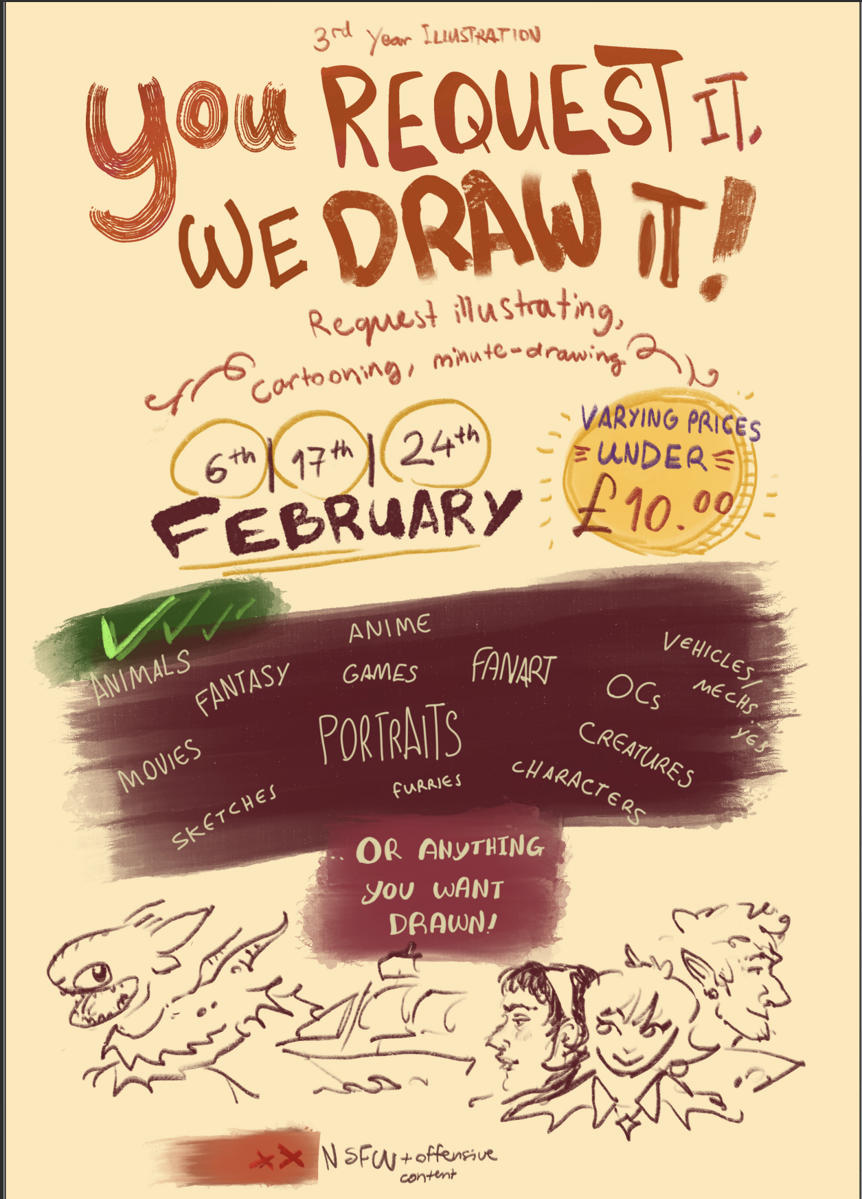
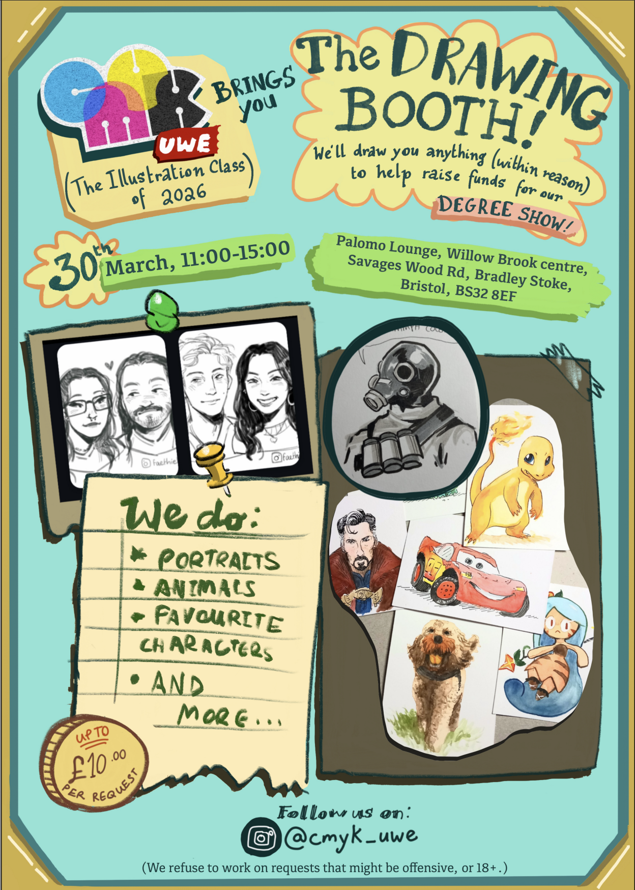
^^ Some promotional prosters that I created to advertise this event a few days before they actually happened ^^
It was actually more time-consuming and information heavy than I predicted, and we also had to remind ourselves to keep documenting work we produced on such events to use as promotion/exemples (since we gave the pieces away).
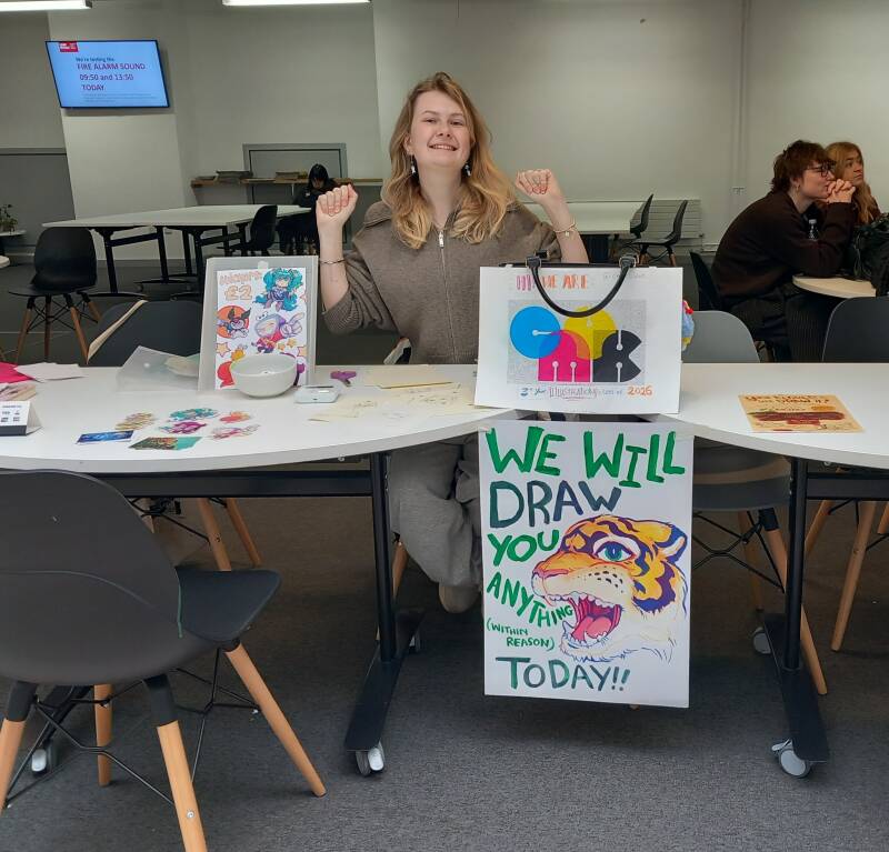

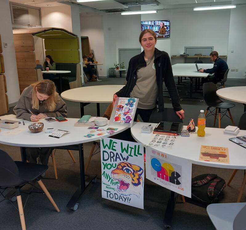
After a few dates at Bower Ashton campus, Jane was a massive help in taking our drawing booth to different places, so she invited us to run this table at the 'Girls' Night In' event, led by the Student's Union up at Frenchay.
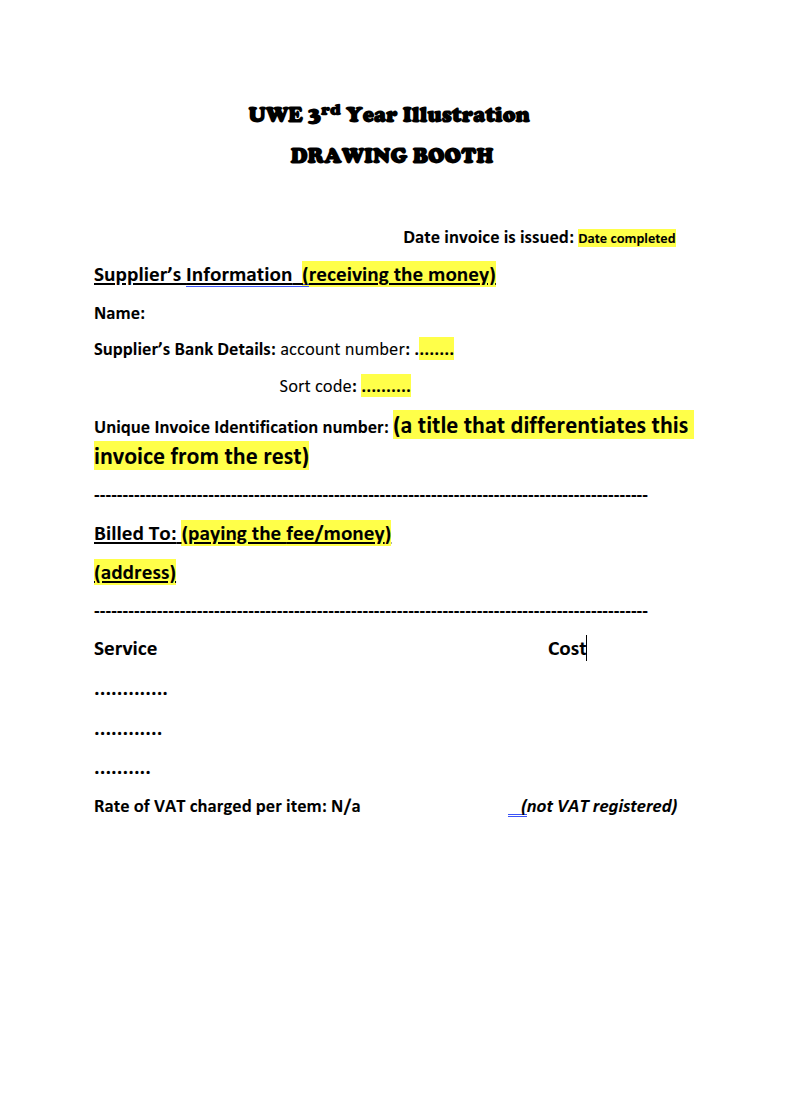
We were going up in the world! As now the Union were paying us rather than having to charge per drawing using card readers. But this also meant making invoices (not a regular activity of mine), which was a very useful learning curve for me, and thankfully this was something Jane also fully supported me with.
(The taxing procedures worried me for a second but after some research into who needs to register for tax, I calmed down when I found out that fundraisers and charities don't have to register, unless its taxable sales would exceed £85,000. Imagine the amount of New Designers we could go to with that money!
So Phew! No HMRC for us for now. But this will likely be the first thing to sort out if we wnat to continue the drawing booth after graduation (we've already applied to SHAKE in October).


It was intersting to see what different demographics requested us to draw. Like at Bower, we had more requests to draw favourite and original characters, and at Frenchay, pets were most popular. Having more artists drawing at the same time also really eases stress as the workload gets spread between people, especially when 5 people would like to request drawings at the same time.
The Girls' Night In event went amazingly well, another lady called Anya Brentnall (this year's Vice President of Sports and Health) saw what our drawing booth was about, and she loved the idea so much that she invited us to the Sports Awards event at Ashton Gate Stadium on the 20th May! This one will be a bigger fish that we hope we can catch, as it will be a venue of 300-350 people with 5 group members so far who'd be up to going crazy for 3 hours.

All theses activities, event advertising and updates also go up on the class Instagram that I am co-running with other classmates called CMYK'26. This I think is a more efficient way to advertise any fundraiser our class might arrange, as it can be readily accessed on a phone and can be shared digitally.


I managed to run the drawing booth solo at my workplace - Palomo Lounge!
And advertising this event on Instagram really paid off this time because the company also shared our advert, which resulted in people actually turning up there on the day just to ask for a drawing. It was an unexpectedly great chance to network too (managers mentioning event drawing at weddings and others asking when this will happen next).
It genuinely felt like a treat to be able draw people's beloved pets, friends and family members due to their appreciation for the work that depicts something they value. They seemed to cherish the drawings more than any photo, and this also helped me notice that something that may seem simple and 'just a doodle' in my eyes could make someone else's day.
However, I noticed that we need to increases our prices per drawing, as customers at Palomo Lounge were more than happy to pay £6 or more for a drawing (something I still need to accept and punch impostor syndrome in the face). Pricing also varies depending the customer population; for example, middle aged guests at a cafe-bar are more likely to be able to afford a £6-10 drawing compared to a university student.
After this event, Palomo Lounge has invited me to an external (outside of University) charity fundraiser in June, where I will be doing this type of drawing on demand activity as well.
The Batsford Prize
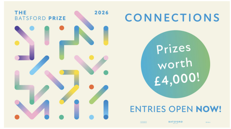
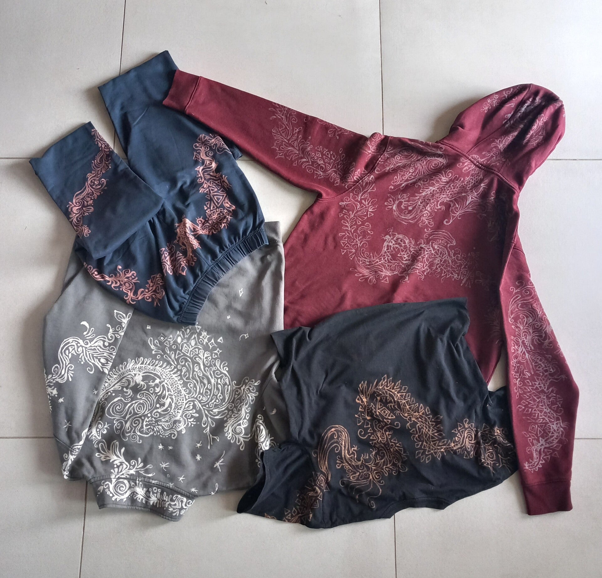
This submission was very last minute, but I quickly found something that fit the brief, although I had produced it in foundation year with themes of representation and connection with oneself (good to be multidisciplinary/multiprocess).
Tobacco Factory Submission and Fundraising
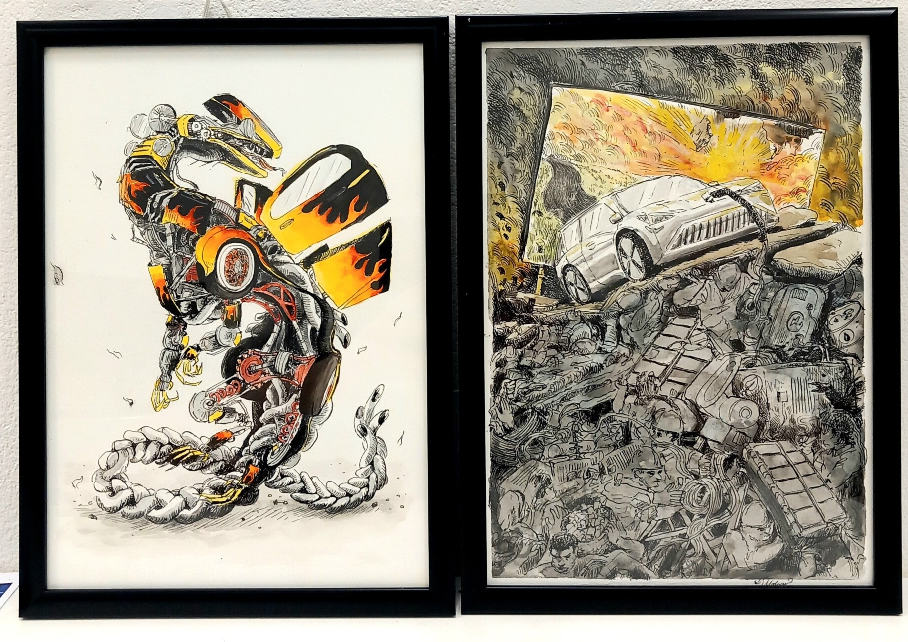
Inspired by Valentine's day, the theme for exhibition submissions was on Love and Hate, and the first thing I could think about that I both loved and resented were cars. On one hand, I find all the thrill in custom cars and races, and I have always thought about vehicles as a creatures due to the way they function (a rabbit hole I went down in during 1st year)...also, transformers! So of course I made a dragon with body parts that were the appropriate alternates to a car's. But I am also very frustrated at cars due to the pollution they cause (their producers are more at fault though) - especially the (hopefully temporary) greenwashing that is happening with EVs.
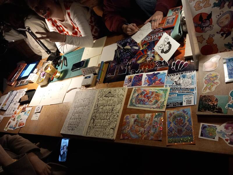
On the evening celebration event of the exhibition at the Tobacco Factorty, the class brought various types of fundraisers to the table, and of course we ran the drawing booth! Again, I think drawing on demand is an overlooked yet high demand approach to fundraising compared to the stable but stereotypical print stall. It is also a great networking and conversation starter, opens up the shiest of customers to infodump and chat about their favourite franchises, and you can 'practice your practice' live for people who don't usually see illustration happening in the moment. We have also realised that working at these drawing booths has improved the speed of our sketching, visual thinking and working process in general (which is great for visualising jobs and editorial work).
Projected Ambience Animation for DunAvon Dance Ensemble's 10th Dance-House Anniversary
The Hungarian folk dance group that I have beeen attending (as time allowed) asked if I could make a piece of background animation for their 10th social dance event ('dance house'). Of course I agreed to it because animation is also something I would devote my life for (will likely attempt to do more professional animation/motion design in the future too).
The brief was to make a 60 second animation that depicts the movement and morphing of regional motifs of the specific regions that the dance group sources their choreographies from. This included 5 areas from Hungary, but mostly from Transylvania (motifs from left to right): Kalotaszeg, Mezokvezsd, Szekelyfold, Szek and Moldva. To make the motifs move with meaning, I was inpired by the dance choreographies of the regions and matched that to their respiective motifs.

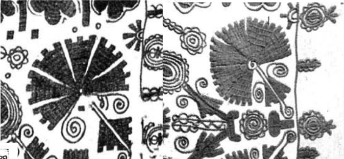
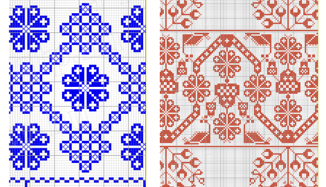

First version of the full 58 seconds >>>
The production process of this volunteering opportunity was similar to the illustration commission pipeline; including the brief and meeting with the person organinsing the event decor, followed by research, storyboarding/pacing, keyframing and inbetweening. The paced version on the right was something I really wanted to continue working on, due containing more dynamic transitions and being a challenge (...and I like challenges...) - especially the 2 people dancing (not rotoscoped). But after discussing this draft with the organiser, I had to agree that it would be way too fast as a larger-scale wall projection, and as I didn't want to cause motion sickness, I decided to slow the pacing down. (see finished below)
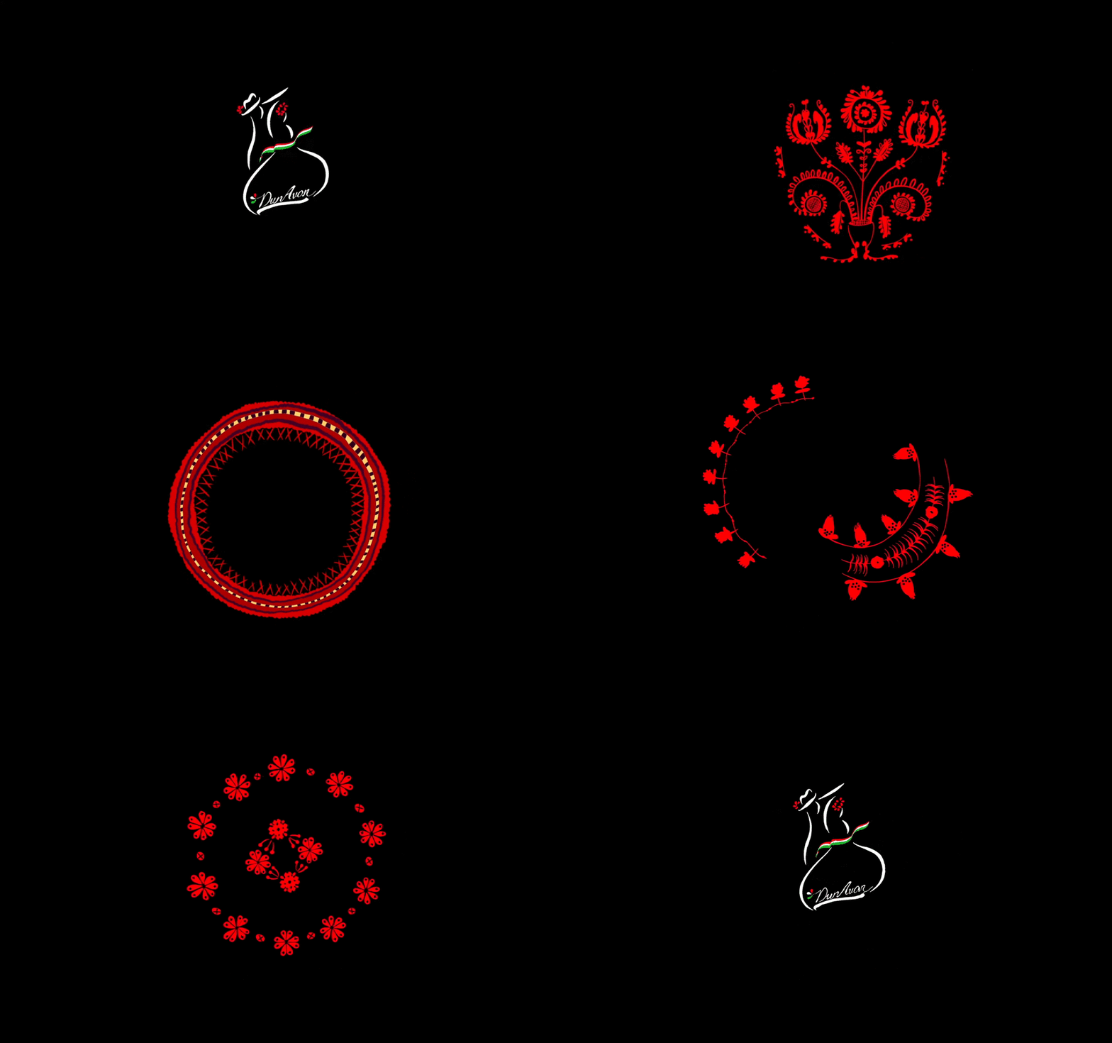
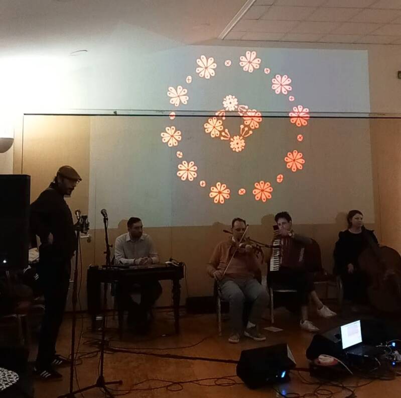
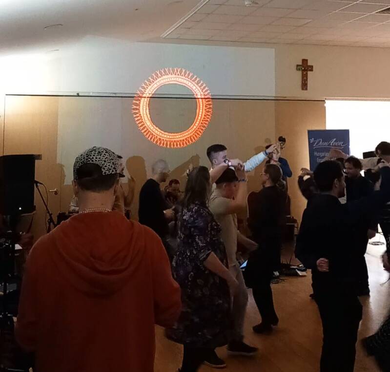
Even if this was a volunteering opportunity to complete 1 minute of animation in 2 weeks (animators would hate this), I loved this 'creative test', I am always more than happy to support folk events, and again didn't fail to start conversations, networking, and encouraging people to ask if I could do something similar them. For example, the co-owner or Replay Boardgame Cafe on Gloucester Rd asked if I'd be interested in helping them redesign their logo, and if I would like to paint an interior mural. I realised that physical presence is so important.
The Original Jigsaw Co Internship
A London based, remote internship opportunity at a sibling-led company that designs and produces jigsaws. I felt like exploring a newer path going towards tabletop games/games in general would be a great way to break into the industry.
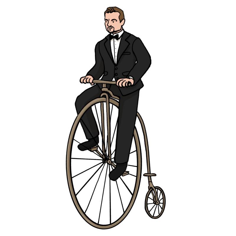
Despite getting through to the 2nd round in the application process (completing a mini brief of drawing Leonardo Dicaprio on a penny farthing), my application was rejected, but I have been informed that my information has been filed if they would need to reach out to any artists in the future. I also have a hunch this was becuse the company was prioritising 2nd year students due to an internship scheme that is tailored to them. (I also applied last year as a 2nd year student through the scheme and got accepted).
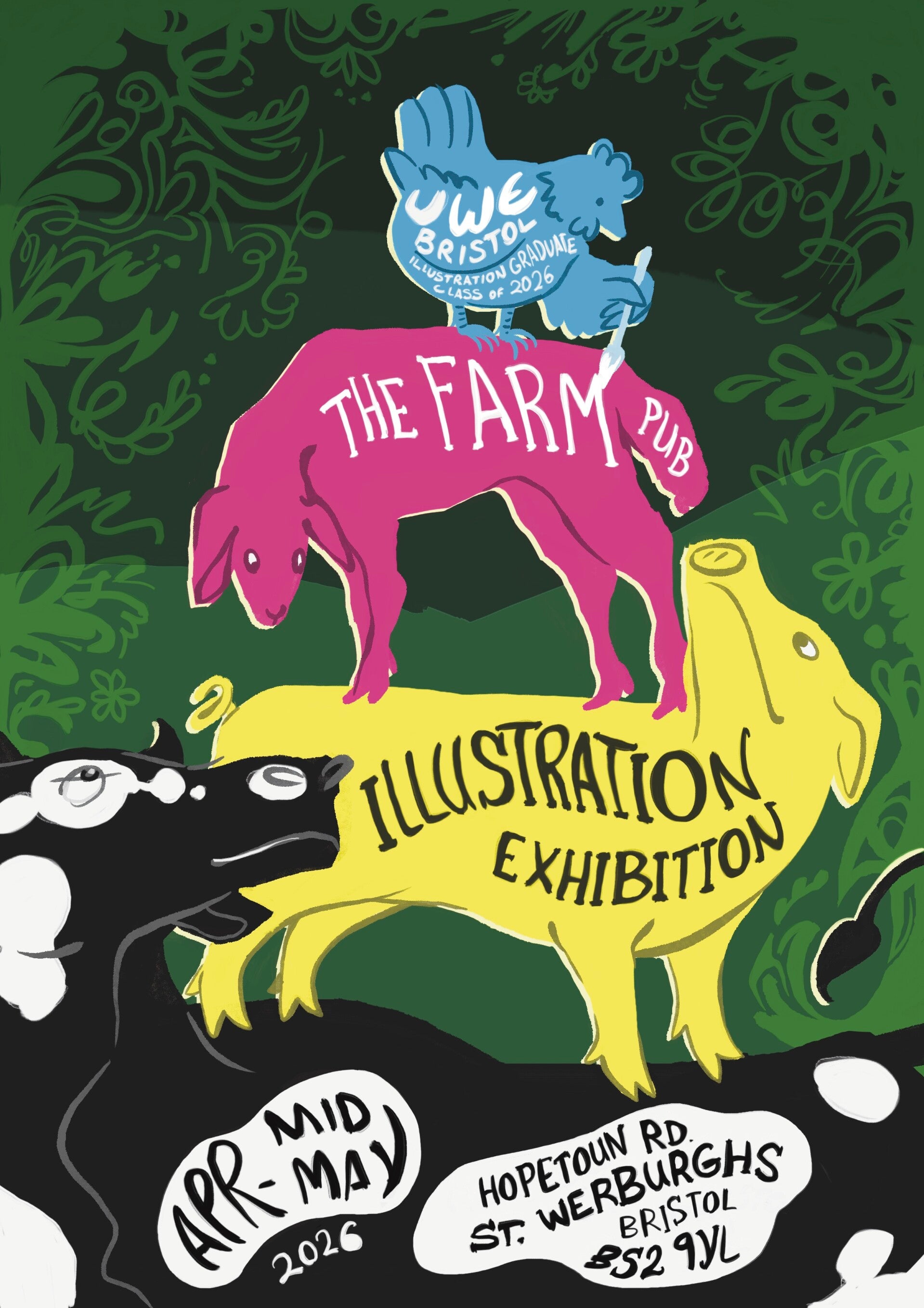
The Farm Exhibition Poster
As always, this was also a very last minute promotional proster that I was most available to make for a second class exhibiton at The Farm pub in St Wereburgh's on 30th May. I attempted to mix our class name's (CMYK) properties with the venue's logo that includes a cow, pig and lamb. But because there are three animals and four colours, I had to add a chicken. It turns out that for me, composing/arranging font is harder than to actually write it, but I managed to spread the text out with remote help and feedback from the class (used the class Instagram group chat for a mini crit).
Macmillan Children's Book Prize
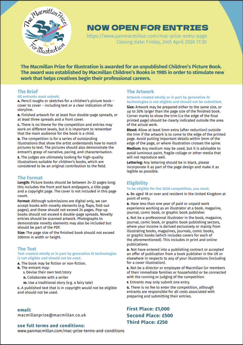
At first, I thought this was going to be another award/ competition submission that I wouldn't give much attanetion to, but this mock-up of a children's story now has its own space in the extended study module too (though still in the form of a mock up due to time restrictions). This is because as an attempt to hit two birds with one stone, it is based on the story I am working on for the extended study, which is about coexistence, overcoming silly conflicts and ocerthrowing corrupt governments with positive resistant methods. One method I proposed in this story is the concept of living a 'Solarpunk' lifestyle, where sustainable technology is used to work and live with the Earth.
On a planet where dragons physically make up nature, a flower nation narrates how the neighbouring industrial nation are destroying their environemnt and home. Until one day, step over the limit and built a creature-like machine that has the potential to cause even more ruin (inspired by an Ai Datacentre). This doesn't go unseen by a absolutely huge dragon, which stomps out the cities of both nations, whiping the slate clean and forcing citizens from both nations to flee into a cave where they have to survive. Their green lifestyle starts by nurturing a rescued plant being kept alive in the darkness by a UV lamp, suggesting themes of coexistence. They then switch to sustainable living methods and grow the plant until it finds its way to natural light, leading the way to the cave's exit.
I wanted to cater to the wider younger audience, so I deliberately used very simple sentences and wording so that it could also be understood by smaller children, whereas the visual narrative would be better suited for an older, 6(oh they're smart)-teen-adult (less so) audience. The idea of coexistence is also addressed in the writing, where the flower people (written from their perspective) created distance and differentiation with the use of 'they built, they consumed' etc. But after the 2 nations were forced together, it turned into 'we worked, we adapted'. This story covers only the perspective of the flower people whereas the reportage will reveal the industrial characters' perspective, and I think tying project pieces together like this is a great way to include this book in my extended study anthology work.
Since I tend to vary media use based on emotion and context, my choices here were to represent pollution with the black ink and line frequency, demonstrated the best on the last spread, where the character is seen cleaning that 'pollution' from the dragon's scales.
Website Building & Career Pathways
After multiple discussions and feedback from tutors and guest lecturers, I was advised to build two websites at the same time, or to 'split my creative identity in two' to then see which side takes off most (simply because I enjoy working in both fields mentioned below and I think both have equal potential to challenge contemporary issues and themes).
Reportage, and 'people-facing'
The site that I am building here on Webador
https://www.juditmolnarillustrates.com/
SCRIBING
https://www.scriberia.com/new-scribe
https://www.instagram.com/liam_callebout/
Some unconventional companies that have branches in Bristol/region and could love some corporate illustration at their events:
NatWest,, Santander, Lloyds Bank, Children's Hospital, Southmead Hospital (other healcrae buildings), Bath University, UOB, Mercedes, Audi, Honda, Heineken
LIVE EVENT ARTISTS
https://www.instagram.com/illustration_by_chan/
https://www.instagram.com/kathyillustration/
https://www.instagram.com/jacquelinebissettliveeventart/
I want to take this further than sketching outfits at weddings!....I know that this might be how I start out at first, but I could then move to POP CULTURE CONVENTIONS (UK based for now) , such as:
BIG: Comic con UK (London, Liverpool, Manchester, Worcester),
SMALLER :Anime and Gaming Con (Bristol, Cardiff, Birmingham, Brighton, London, Belfast, Newcastle, Norwich, Portsmouth, Leeds, Glasgow etc)
Other cultural conventions/meets/festivals that would love some art:
SMALLER: Hay Festival, Harvest Festival, Green Man, Latitude, Glastonbury Mediavl Fayre, Green Gathering, Tewkesbury Medieval fair, Sussex Medival Fest
VISUAL JOURNALISM
CONTACT: MAGAZINES: Nat Geo, Avon Wildlife Trust, Sapiens,
CONTACT: PUBLISHERS: Guardian (Katharine Viner), The Economist (Zanny Minton Beddoes), The Private Eye (Ian Hislop)
ARTISTS:
https://www.instagram.com/georgebutlerillustration/
https://www.instagram.com/lucindarogers1/
https://www.instagram.com/jedidore/
JOURNALS: The Reportager https://reportager.uwe.ac.uk/projects16/peterblodau/index.htm
VISUAL JOURNALISM IN EDITORIAL WORK + MURALS?
Visual Development and Concept Design
https://jmolnarti.wordpress.com/
( https://www.artstation.com/juditmolnar9 )
Despite it also aligning with my big 'what if?' questions in my works seen on this website, concept art slightly strays away from conventional illustration due to its presentation and its functions. As this is more developmental work for things that fit WITHIN a production pipeline (rather than made as a final outcome or authorial piece), it needs to be more precise and design-based.
VISUALISER (DESIGN)
CONCEPT ARTIST
GENERALIST
ENVIRONMENT, PROP, CHARACTER DESIGNER
ILLUSTRATOR (BOARDGAME/GAME DESIGN/ANI/FILM DEV.)
https://company.wizards.com/en/careers
Client List
Worked for/collaborated with:
- DunAvon Dance Ensemble
- Lounge Bristol
- Bristol Palestine Coalition
- Dark Cornwall
Asked if I was available, but haven’t yet contacted me:
- Replay Boardgame Cafe
- Multiple people showing interest for murals
I have contacted for collaboration:
- Pollinator pathways
Aimed studios for concept art/illustration:
- Wizards of the Coast
- Games Workshop
- Fortiche (more animation)
- Riot
- Amanita Design
Aimed companies for visual scribing
- Scriberia
- Avon Wildlife Trust, TED(?) (TEDed animation too?), TrueSpeed, Ecotalk, Toyota, Sustainable Innovation Summits: zero World, ESS expo, Source fashion, ReGeneration Earth UK)
Aimed companies/publishers/news.agazines for research/reportage/editorial
- Documentary/visual journalism funds
- Bertha Dochouse - (filmbased) documentary funding opportunity database
- International Documentary Association (IDA)
- https://www.journoresources.org.uk/journalism-degree-funding-training-complete-list/ Journoresources
- https://gfmd.info/fundings/ global forum for media development oppoortunities
- https://gijn.org/resource/grants-fellowships/ global international journalism network
- Guardian
- The Economist
- Avon Wildlife Trust
- Penguin Books
- Bloomsbury
Independent
- Drawing booth as a collective, taken to conventions (Anime and Gaming con, Comic con, Fairs – applied to SHAKE Bristol) and festivals (Hay Festival, Latitude)
- Independent Startup – Collaboratively Developing ‘Hommidge’ the cardgame
Website Research
Olivier Kugler
Different prfessional pfcuses also meant different ways of building websites
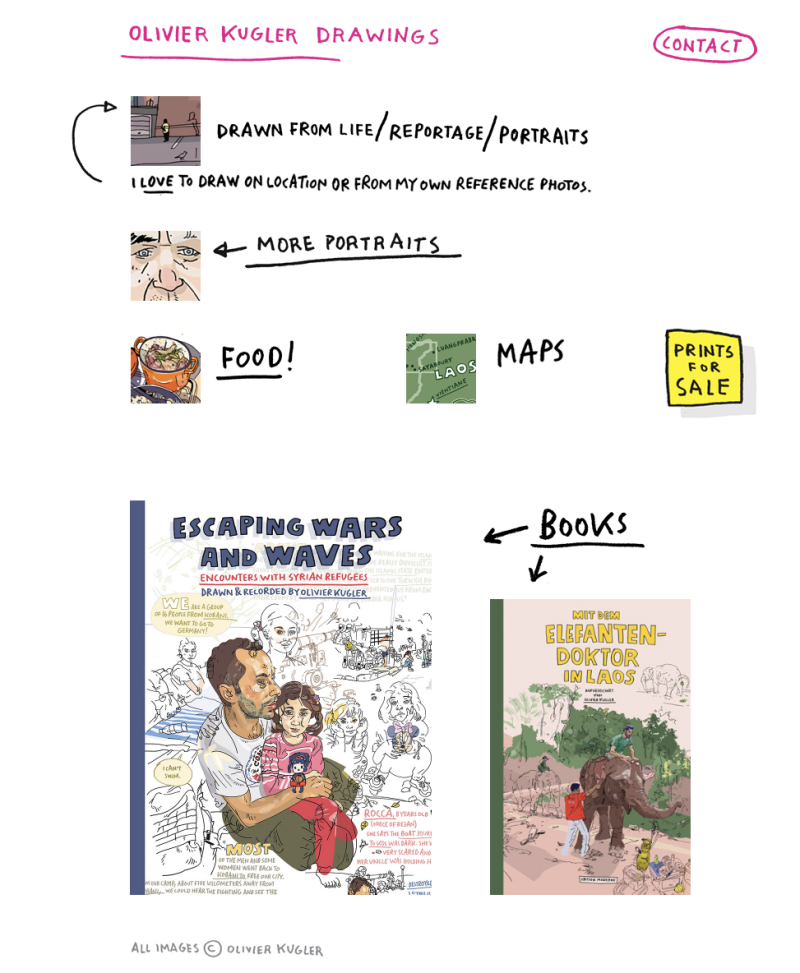
For the exmaple of a reprortage artist, Olivier Kugler's website is clearly catergorised in to sections for his projects which then open into separacter pages for one project per page. I think this is a very sensible way to manage busy, resarch-based projects, but I stayed at keeping projects on the same page for a better management of pages, links and buttons
Josh Atack
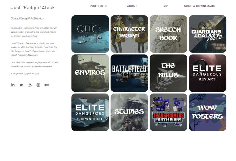
Jjosh Atack's digital portfolio is a great exmaple of a concept art website, as it presents multiple projects on one page, like for 'character design' or 'enviros', because even though they are depict different contexts from mountains buildings, they are still under one umbrella of 'environment'. This clarity is also used well for separating out the bigger projects he has worked on which all demand their own space. The 'quick tour' and the paragraph briefly listing his experience adds a lot of convenience for anyone quickly skimming through his site (as he mentioned that art directors has little time to look at artists' work when recruiting, so the websites/portfolios need to be as clear and concise as possible).
Liam Callebout
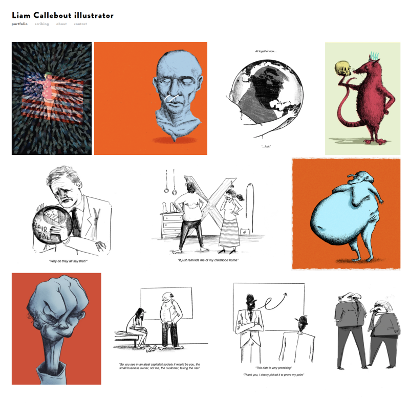
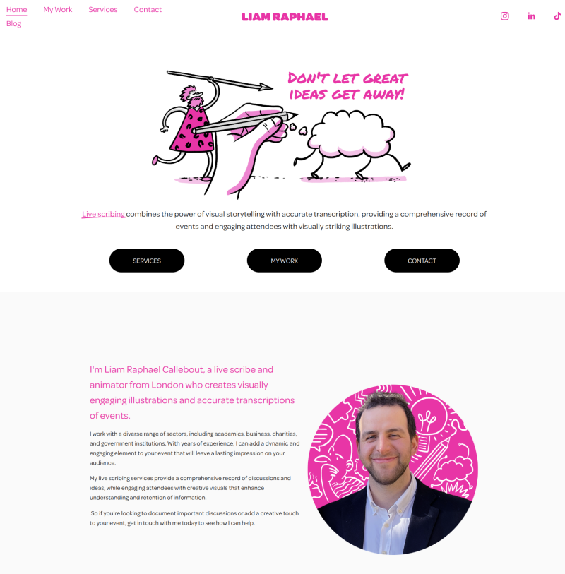
Laim Callebout is an illustrator sharing a simply arranged gallery of editorial illustrations on one site, and from the same website through a separate page and button, one can visit his scribing work. Multiple 'creative identities' is not so common and ususally artists have all their work on on site. But as someone who also has multiple branches of practice, I might also need to buid my site like this (see button in main menu), as this allows clarity and multiple interests at the same time.
Self Promotion
Apart from the fundrasing events we have been doing with the ndrawing booth, I have already started running my own tables at external events/fundraisers (before this module). And out of desperation and lack of time, I was pushed to quickly develop these cards from scratch (hand written,

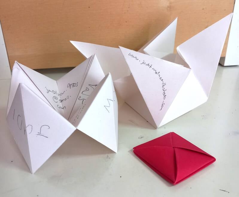
These business cards are clever and their structures would support my multiple focuses on one piece, but I think that would be weak if if I'd be promoting myself to one spicific audience (e.g. it would be pointless to adventise my dark fanatsy concept work to a children's publisher). This would also be less forgiving when it comes to printing and folding many in batches.
So, I believe a more unique and cheaper approach would be to print the text onto some typical business card-sized paper, and then free-hand draw an appropriate sketch on the other side, almost like visually signing it with a little original piece (which is what makes it special for the client). The sketches could vary, but the paper being the same colour would clarify that these business cards originate from the same person. The simple buisness card size and shape could also allow for better storage and damage to it would be less likely.
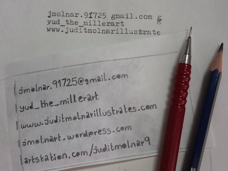
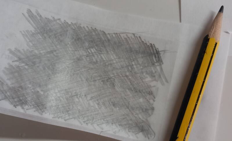
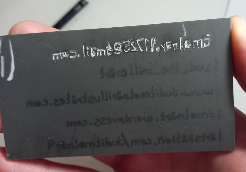

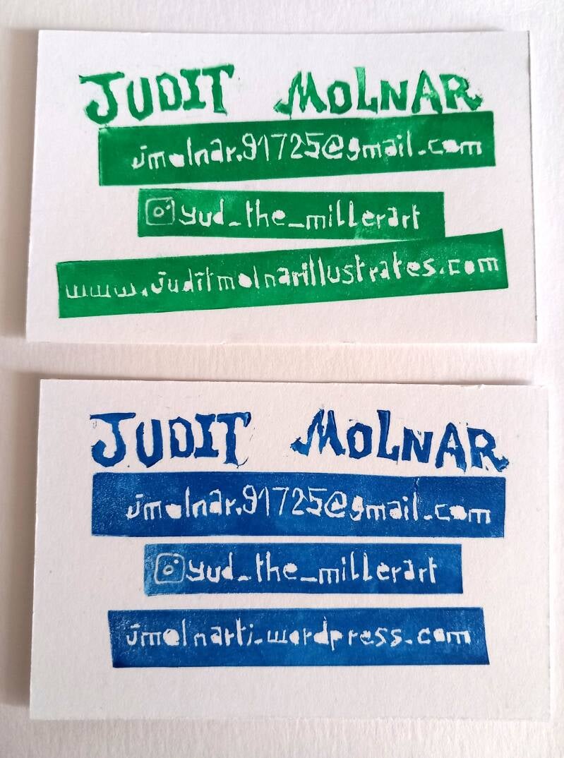
Each business card’s text placement is unique due to being individually lino printed by hand. Although this is a more effortful and time consuming production process compared to digitally printing them, this adds value to the cards and follows my creative practice value of being less dependent on digital technology and reducing my consumption. The business cards for the reportage and socially engaging illustrations contain my (less developed) instagram account's username and appropriate website address, and I thought adding a bespoke, micro-informing doodle on the other side would support in demonstrating my live illustration skills. They all include a small fact, diagram or relatable characters from the real world.
The other, blue cards represent my concept art/illustration side including the relevant instagram account (more developed and older) and website address. For the other side of these cards, I added profile portraits of characters who appear in my extended study module work, all facing the same way and with the same visual language to create similarity to help with identifying my business cards.
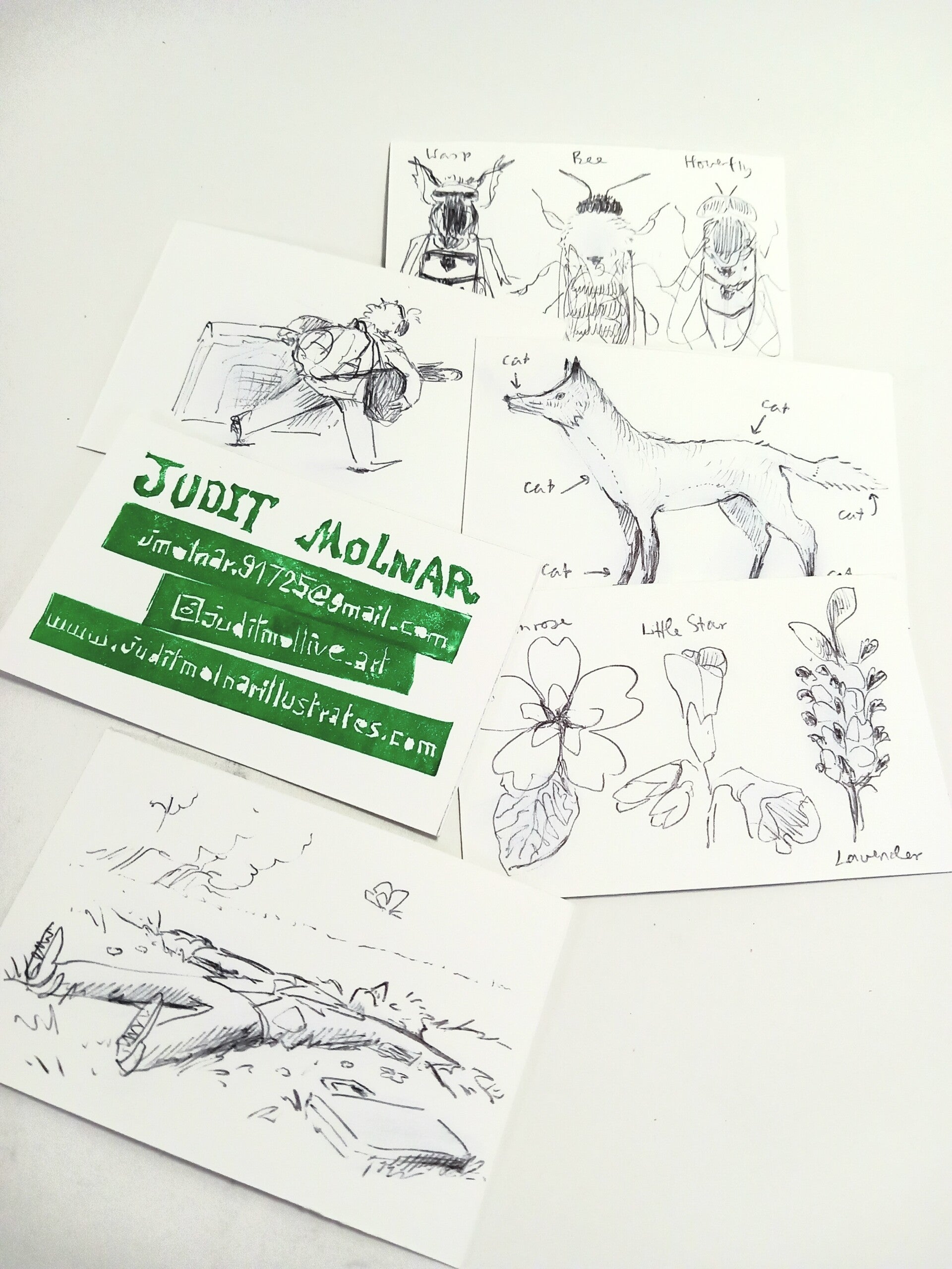

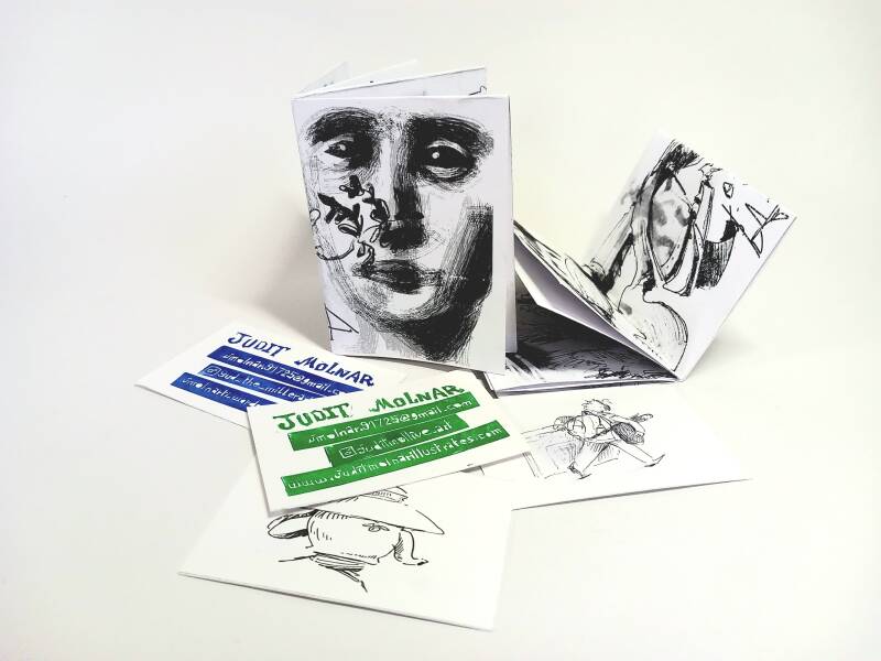
I also thought it would be a nice idea to make very simple trash zines that only contain my doodles and sketches, inspired by Wocco's (Warwick Johnson Cadwell) promotional material, which was essentially just mini zines of his work. But next time, I will have to include more sketches that are relevant to projects I'm doing, not just some last minute scribbles. This adds context and helps the audience connect my creative identity to my promotional material and creative work.
Networking at the Glastonbury Abbey Medieval Fayre
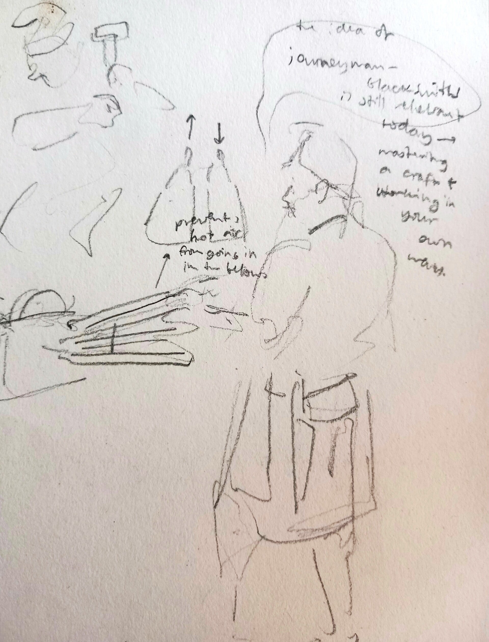
I had to grab this last-minute networking opportunity (in my eyes), which was visiting the Glastonbury Abbey Medieval Fayre and to one, enjoy the hell out of it, and to also connect with the craftsmen and performers. For example, the company running the jousting tournament (Knights of Albion and Outlaw Entertainments) and the people who brought owls (Owl Enlightenment) are both heavily event-based and are brimming with animal and people-stories, creating an ideal environment for visual journalism to thrive.
OWL ENLIGHTENMENT:
https://www.owlenlightment.org/owl-experiences.html
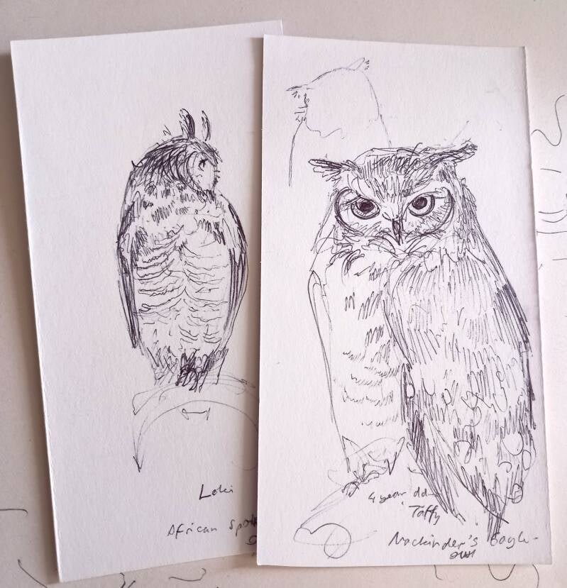
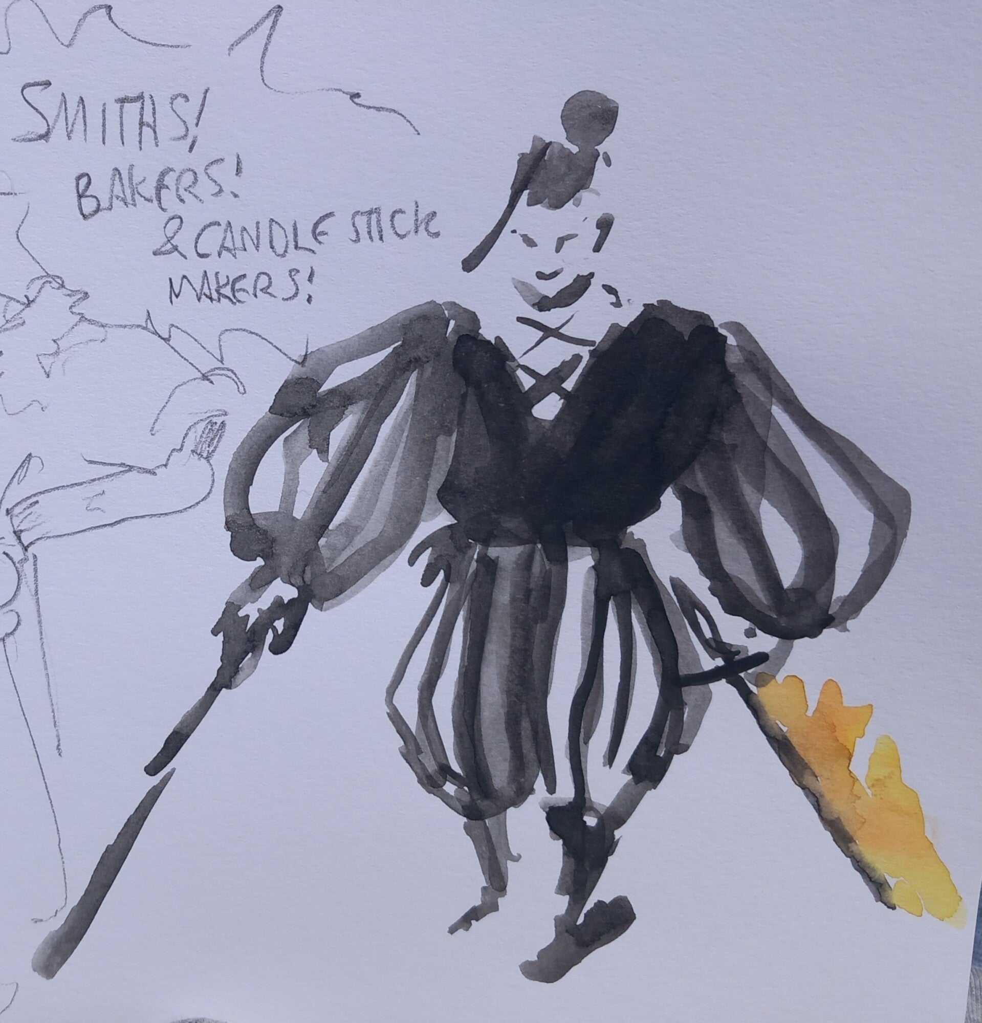
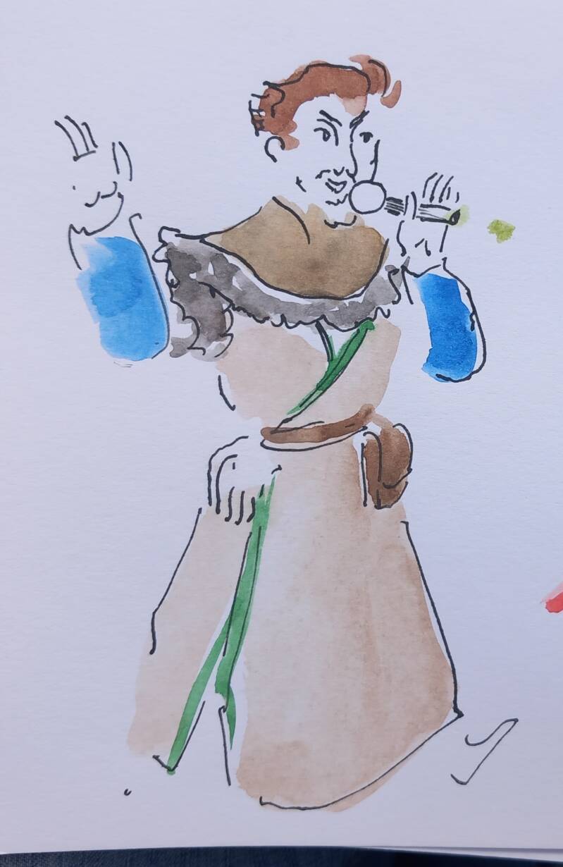

The method I used to network and create a subtle yet lasting impression was to make sketches of their events pro pono, add my contacts, and then to hand it over for them to keep. This way, I communicate that I'm an available artist they could contact IF they like my work, and also to give them a little present as gratitude for their amazing performances. We have also managed to follow each other on Instagram after the event, meaning that we have both created value and left impressions on each other.
Exit Stratergies
People facing
Next: complete and submit the application to Scriberia
- visit community agro. places like Grow Wilder, and both city farms (Windmill Hill + St Wereburgh’s) to interview people about their ideas on solarpunk, possible sustainable futures and what would an ideal future community look like
- Contact small holding communities in the UK to visit them, interview and reportage with them
- Continue building a portfolio of events that you visited and produced reportage at
- Then apply to magazines/news broadcasters, publishers, grants
- Apply for scribing opportunities at companies like: NatWest,, Santander, Lloyds Bank, Children's Hospital, Southmead Hospital (other healthcare buildings), Bath University, UOB, Mercedes, Audi, Honda, Heineken
- Discuss with the ‘Drawing Booth’ fundraiser group if we want to become a collective after graduating (as this idea was mentioned once in a group tutorial). This is so that we could continue to draw for people and even get involved in live/event illustration.
- Table/network at pop culture and gaming conventions, other live events, festivals like (Hay Festival, Harvest Festival, Green Man, Latitude, Glastonbury Medieval Fayre, Green Gathering, Tewkesbury Medieval fair, Sussex Medieval Fest)
- Build/document this on the second Instagram account
Concept Design
- Continue practicing rendering solid objects realistically (painting car murals)
- Refine concept art portfolio to submit to Games Workshop, and Wizards of the Coast (to eventually develop games with themes relevant to real life that push players to strategize and cooperate).
- Attend community meet ups and events to draw live – table at conventions. Best place to start would be to interact with the community: attend card playing sessions at Bristol Excelsior, and the Nationwide Anime and Gaming Con as practice – chance to network, meet competition, potential clients
- Build Artstation profile
- Develop Hommidge with more confidence (using Josh Atack’s advice on sourcing inspiration from existing/historical cultures)
- But otherwise explore opportunities in unconventional gatherings like Medieval Fayres (Tewkesbury, Sussex and Glastonbury), and Hay Festival, Harvest Festival, Green Man, Latitude, Green Gathering, (where people can celebrate their innovative thoughts.
If nothing will catch until December, find an apprenticeship that has relevance to creative careers and is in high demand, like fabrication, carpentry etc.
Reflective Report
I realised how vital the process of clarifying my preferred way of working was, as I submitted to competitions like the Batsford Awards, exhibited at the Tobacco Factory and investigated what the audience wants from illustration as a service. Physical presence is also key, as I received appreciation for my work (such as request illustrating at the Lounge or animating for DunAvon Dance), which made me feel hopeful about my ability to become hired in the future despite having a fluctuating visual language. These opportunities taught me about the networking snowball effect when your work is viewed by the public, as multiple individuals and even a company owner (of Replay Boardgame Cafe) asked if I was available to do commissions and mural work. People that I drew in live events, like at the Glastonbury Medieval Fayre and the Art and Resistance event from the Bristol Palestine Coalition were also highly appreciative of reportage drawings I produced during the event – asking for contacts and if they could have a copy of the sketches.
At first, getting rejections discouraged me, but I noticed that they are part of application processes, like The Original Jigsaw Co’s rejection of my internship application, or when companies I emailed did not reply. This is understandable due to preference towards other applications and emails might get lost in busy inboxes. But I found that I got much more positive replies after showing up on location to physically network with the client.
Curating my work onto a portfolio website helped me accept that the flamboyance of my multidisciplinary practice might have drawbacks, like having inconsistency in the presentation and visual language of my work, losing the attention of time-starved creative directors in the editorial field who are looking for visually stable and safe artists to work with. However, wearing multiple ‘visual hats’ and varying the way work is expressed can also be a strength, providing adaptability (essential for visual development pipelines in game and film studios) and demonstrating explorative and dynamic working that can be applied to many creative fields (experienced being asked to do animation, murals, logos live illustrations and more), thus providing a better chance of survival in the ‘creative wilderness’.
Although wearing multiple hats is much more stressful, I am attempting to work in more fields to see which one will catch on the most or first. This is evident in having two separate business cards and website links, for concept design and the other for reportage and live illustration, as these are the two main fields that support my values of returning curiosity and hope.
After graduating, I am planning refine and submit my concept design portfolio to different game studios like Wizards of the Coast and Games Workshop to see if I could be added to an artist contact list. I will also continue building my live illustration portfolio to contact news publishers and magazines that I share values with like the Guardian and Avon Wildlife Trust
Create Your Own Website With Webador